After messing around with various glitching techniques, I needed to start putting my focus back onto the architectural and landscape aspects of my work that pushed me into that frame in the first place. Armed with the photographs I took over the summer that can be seen in this post here, I began again to review the aesthetic I want to carry forward. This is primarily a straight lined, flat surfaced ideal, brought out of an interest in post-war social housing, brutalism and the like. New buildings that have risen in my lifetime have primarily been glass skinned and steel boned, the skeleton on show to highlight the achievement of man over his environment such as Norman Foster’s HSBC building in Hong Kong.
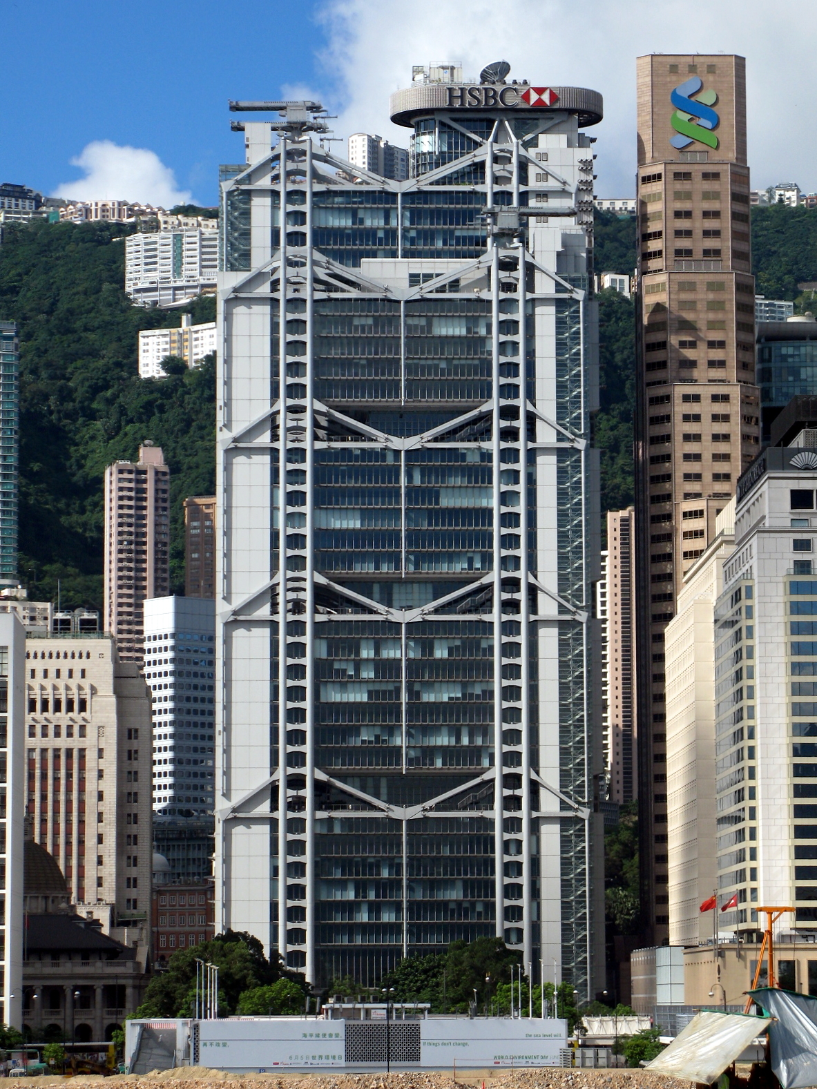
A trend towards this can be mapped through the skyscrapers of New York and Chicago of the past half-century. The building stands as a battleship against the bunker-like buildings surrounding it, though the sea is much more steel and marble in London. Neither the extravagance of carved marble nor the extravagance of the reductionist steel excites me, it is the utopian ideal of the house for everyone that gets me. This is probably as a result of moving away from home and the cost of living becoming a real factor in my life, I am faced with a future that seems to want to deny me a dwelling without moving away from my cultural hub or paying through the nose.
In my earlier paintings I used perspective to place my buildings in an environment, however I decided to try a different technique this time. By drawing a relatively flat image, the viewer is confronted with what they are seeing, there is no drawing of the eye to any particular point or the horizon. Instead things appear with the glazed stare in which I often see the world, never inspecting or looking, the environment simply passes itself as a continuous series of images in front of my eyes. The blankness again lends itself to this indifference, a suggestion of surface is described by its edges, no shading interrupts or instructs what you’re seeing.

After the talk at Alan Cristea by Gordon Cheung, I met Venetia Norris, an artist whose interest is primarily involved with drawing flowers. The main thing that struck me about her work was the way in which she introduces paint into her drawings. A singular colour wash opens the eye up against a monochromatic series of pencil marks, bringing out shape, texture and form.

I decided to try this technique with a drawing I was doing of a tower block. The source image has light pouring through a stairwell that drifts its way up the centre of the building, which I thought would be perfect for the effect.
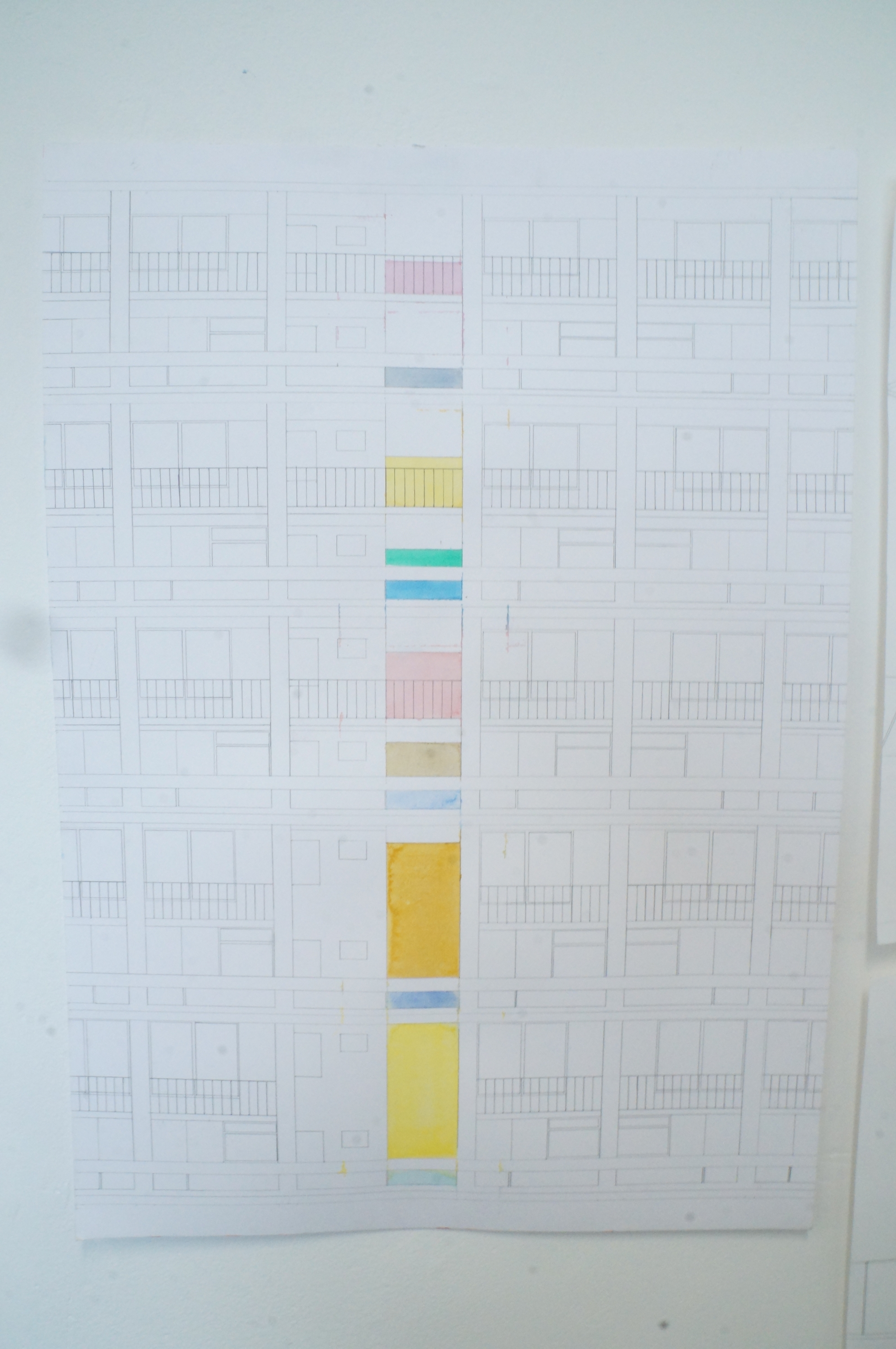
I really like the way the piece turned out, the rigid structure of the rooms and blocks allows one to get lost in a maze of lines, but the colour brings it back to attention. The way the block takes the whole of the image again I feel is a way of calling attention, there is no escape from what you are seeing, therefore you are forced to inspect, no longer can this be a passive experience.

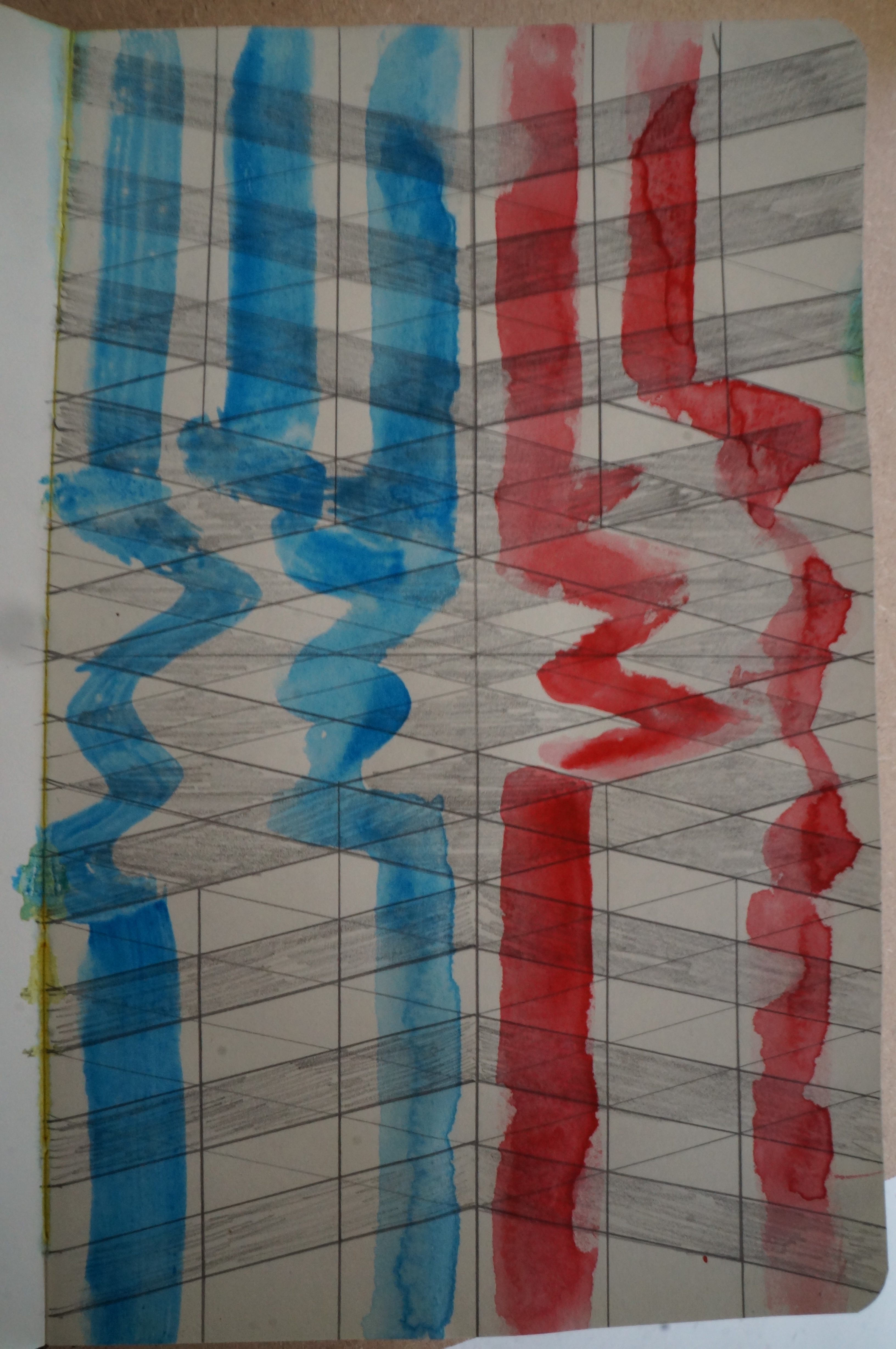
When having a stumble around gallery archives, I came across the work of Jack Spencer Ashworth. His pieces carry a new way of looking at the digital aesthetic that interested me in Gordon Cheung and Kim Asendorf. The intervention of the grid within his work adds motion to the relatively still figurative painting. Furthermore, in breaking up the figure, one is forced to bring in thought to complete the puzzle of what we are faced with. It becomes visceral in the sense that Bacon or Freud made their work, but updated to a century of computers, 1’s and 0’s, uncertainty and change.

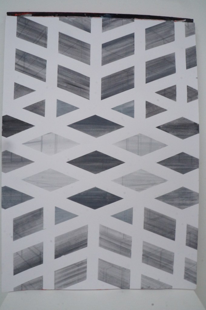
This method of breaking up the image is something that I wanted to try therefore as I saw it as a way of mimicking a vector grid.
To try out this effect I began to draw out my own grid, intending to just see the kind of corner effect that is created in Ashworth’s paintings. However, soon after beginning I began to change the grid into a more Escher like drawing, creating an impossible geometry with straight lines that also appears to define a space.
To lead the eye more and open out the effect, I traced the red and blue through the drawing. It sort of worked (When displayed upside down) but more definition around the lines would really be needed.
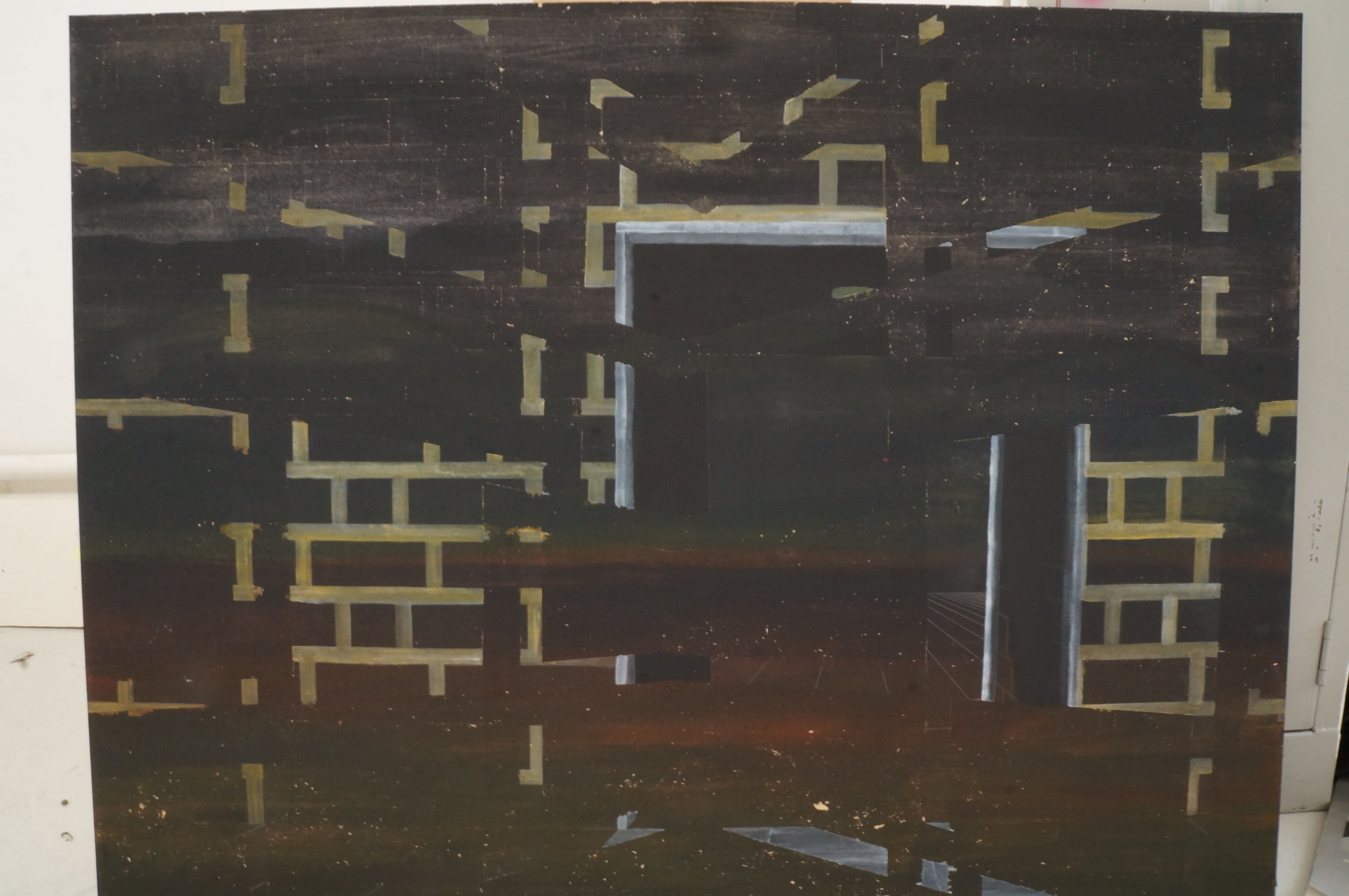
I carried that same grid onwards to my next drawing, marking it out in tape (which would have a slightly different effect to the pencil) but made a slight mistake that interrupts the symmetry but in itself isn’t catastrophic.

For the drawing itself I chose to construct a corner of a building, using perspective again but taking the cue from my last piece and having the building-subject fill the whole space. Furthermore, I wished to see whether I could make apparent a solidity of the masked environment as well as that of the image that lies underneath.
When painted it becomes clearer my intention of having the masking reflect the style of architecture I want to carry forward. Sharp edges and corners line a square courtyard, with pillars rising in front of a flat surface, equally reflected by a drop at the bottom of the picture.
I am not that convinced at the success of the drawing and its penetration of the paint above it. This is probably as a fault of the use of very watered down acrylic paint but I did not have any watercolour black or white to hand.
Again I feel that the forms I wanted to suggest with the grid don’t quite feel solid enough, but I am unsure whether adding more lines would help, or small figures to suggest the clutch of gravity.


Another artist I met at Gordon Cheung’s talk was Ben Coiacetto whose paintings are pretty awesome but unfortunately not too related to my own practice.
However, when talking about his methods in painting, he told me that he prefers to build up layers of tones over a painting, bringing a depth of colour that is impossible to find otherwise. Having never approached a work in this way I decided to try it, applying thin watered down layers of acrylic over each other. More layers would have given more depth, but this was just another experimental piece for me to try some ideas on.
I began by covering the painting in black, then adding bits of blue, yellow and red intermittently to create a subtle landscape as a background.
Then I applied a chevron like pattern of masking tape on top, cut out some bits and added some more before painting the archway over the top. I was going to fill in the bricks but seeing them just as mortar with the background filling in the actual brick-part seemed in keeping with the darkness of the landscape.
The piece itself I found to be very successful, though the masking tape did take a lot of the paint with it, leaving stipples of bare MDF all across the work, this could be perhaps reduced by using more paint or perhaps another tape.
Next I have a tutorial that I hope will give me a fresh perspective on my work, stay tuned.

Leave a comment